
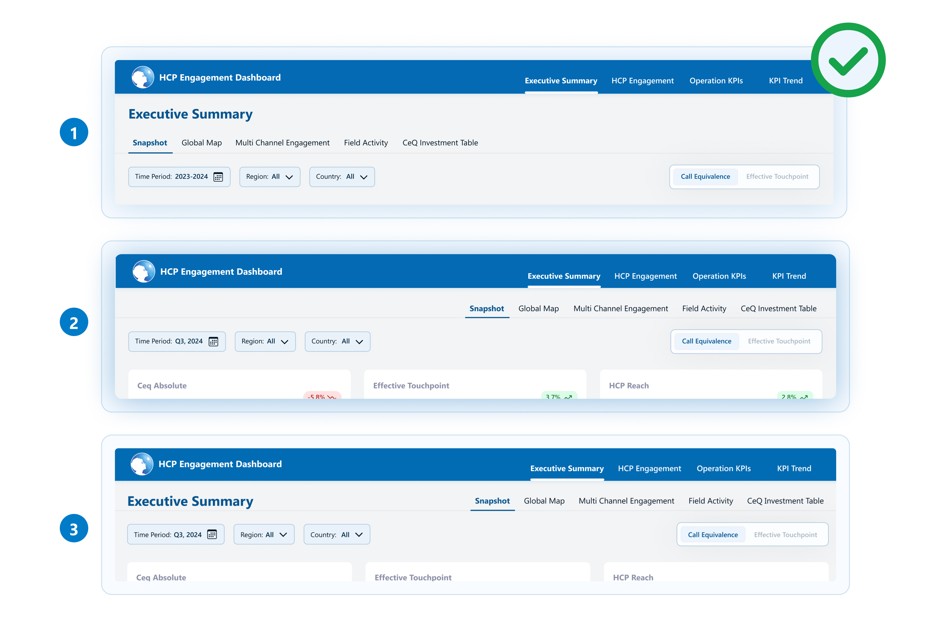
Simplified IA
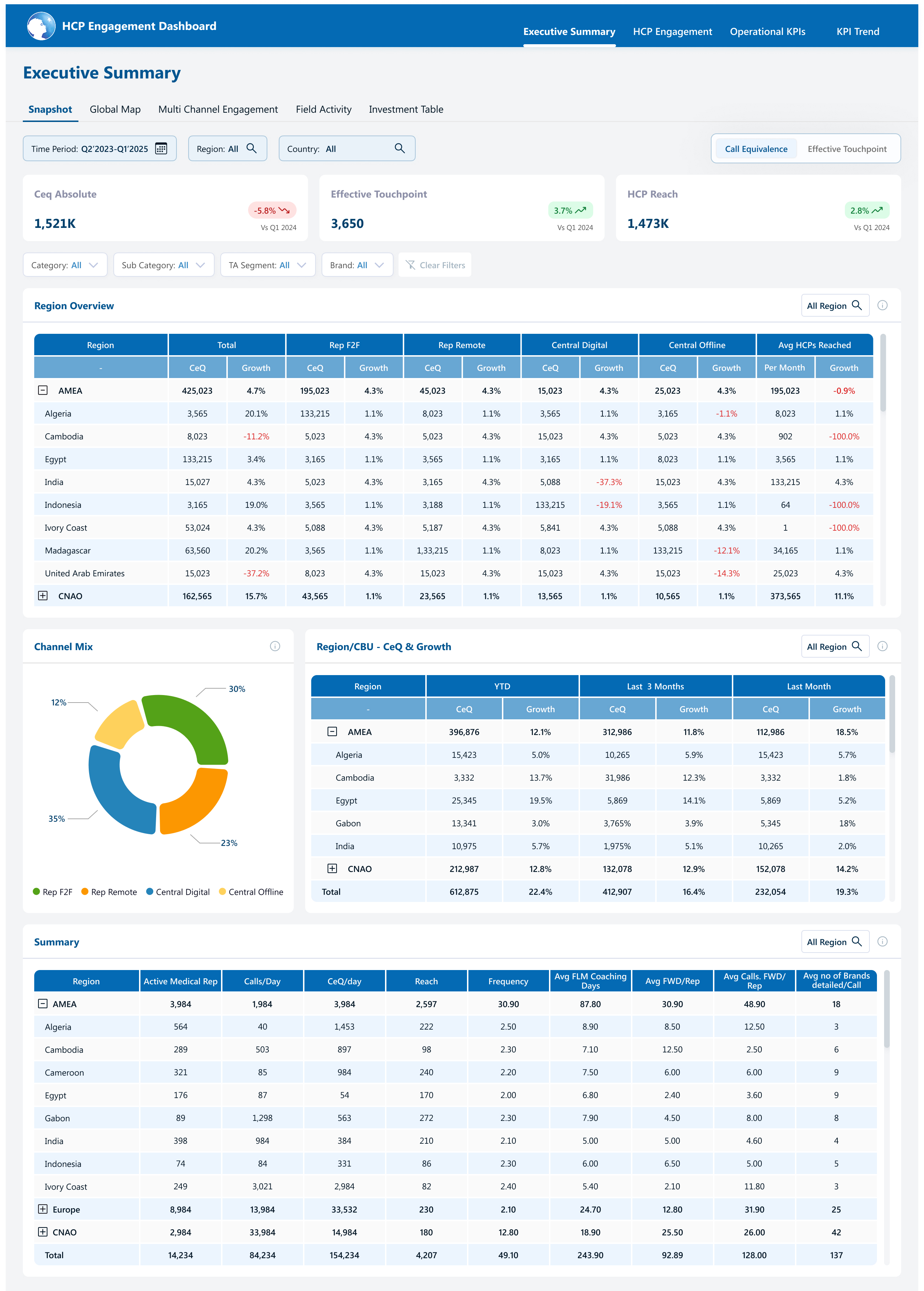
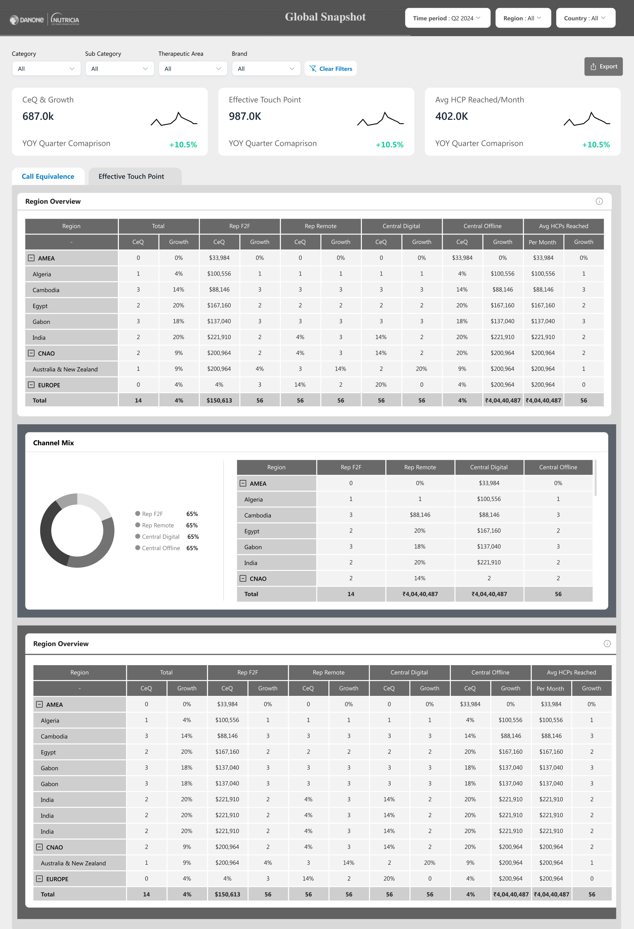
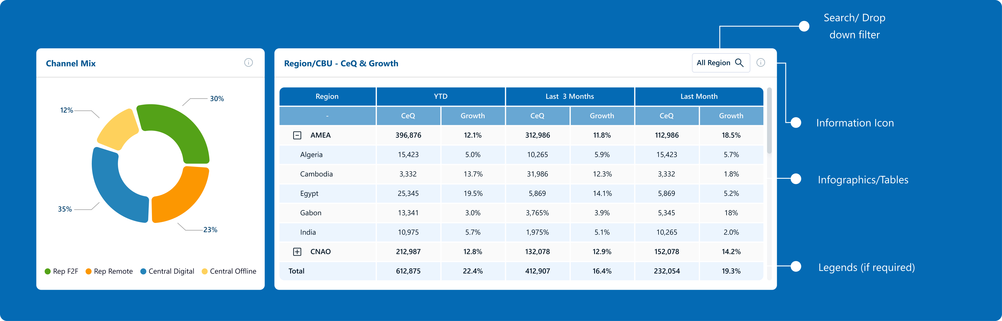
The dashboard is now organized by data-based categories, consolidating similar KPIs and reducing redundancy.


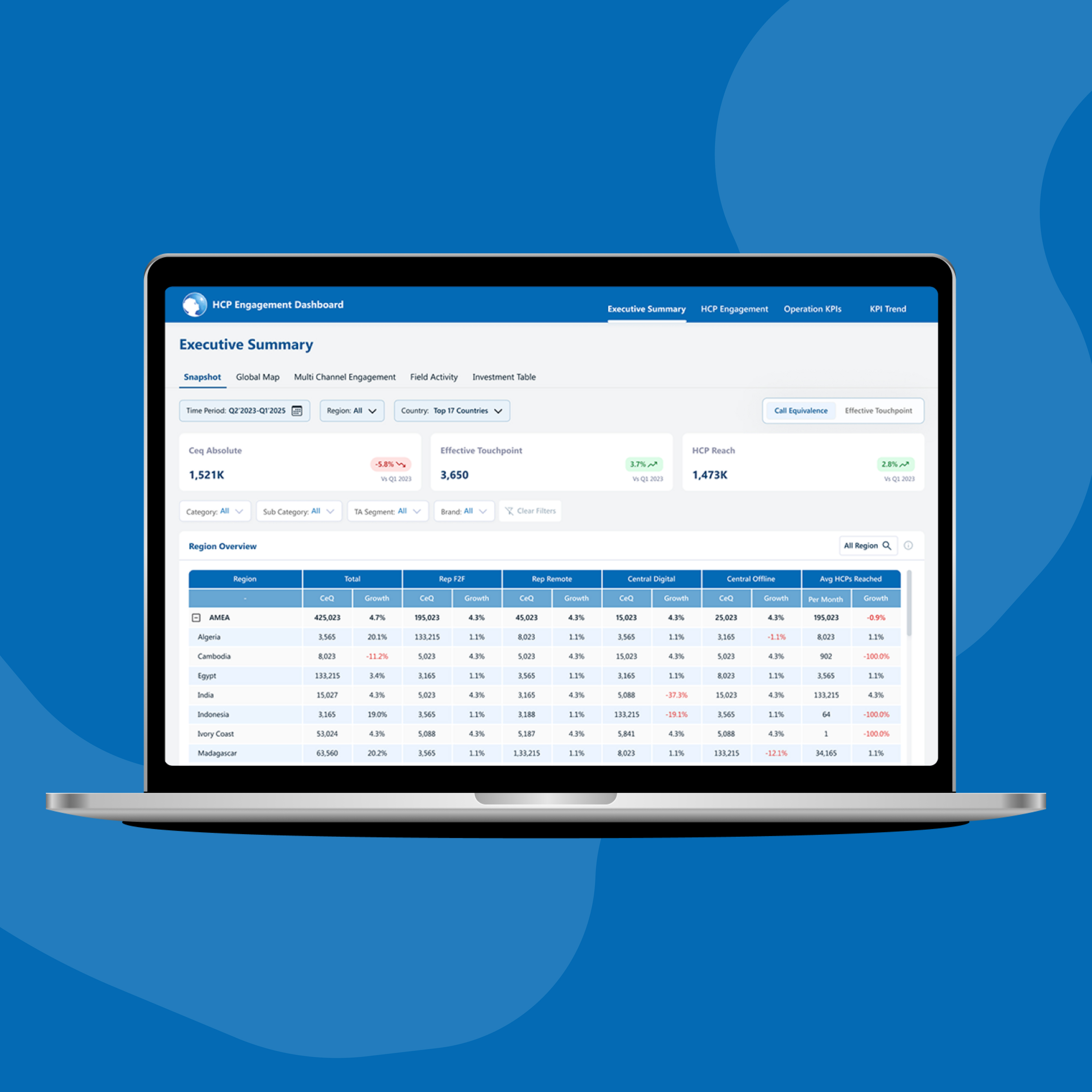
Sales dashboard for healthcare professionals (HCPs) to track their performance & engagement in the allocated market across APAC regions.
45+
screens

10hrs+
interviews
3
members
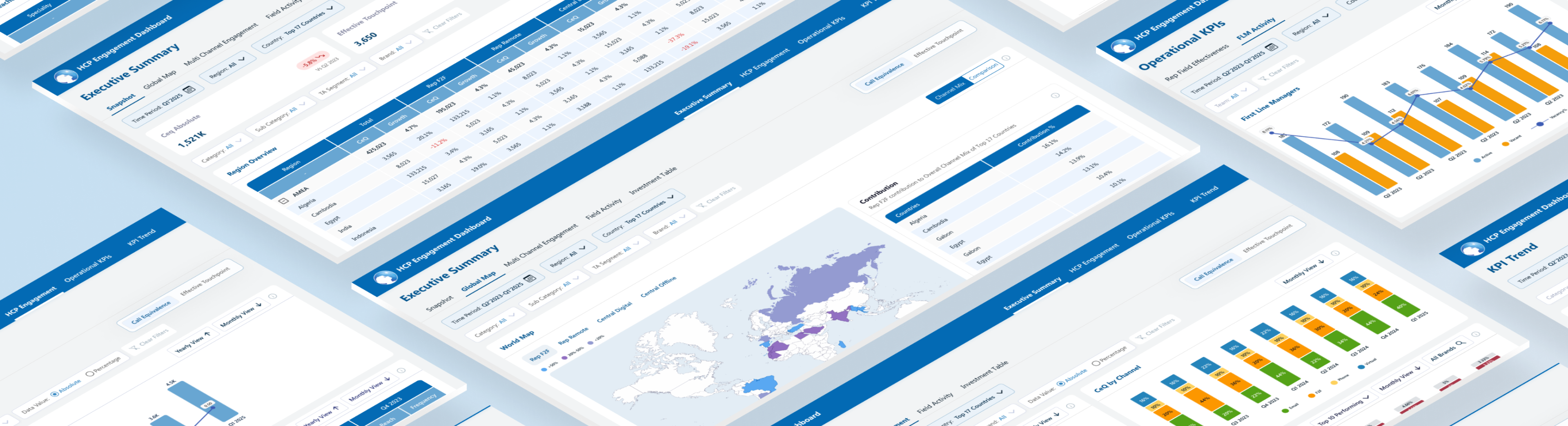
Made in Figma. Designed for Power BI.

PHASE I: RESEARCH

Focus on an improved digital experience for enhanced functionality.
Merge overlapping reports to streamline data presentation.

Adopt a clean design and create a cohesive visual language.

Ensure quick access to most used and relevant data metrics.
Post research and interviews, we could identify the problems and clubbed them into three main areas:
UX and Navigation Challenges
Excessive scrolling and confusing navigation structure make it difficult for users to quickly access important data.
Information Overload and Redundancy
Cluttered data presentations and repeated KPIs across sections create confusion and make it hard for users to focus on key metrics.
Design and Accessibility Issues
Inconsistent design elements and poor space utilization impact visual clarity and accessibility, making it challenging for users to find relevant information quickly.
The dashboard is now organized by data-based categories, consolidating similar KPIs and reducing redundancy.

Introduced broader categories and subcategories, reducing confusion and focusing on essential metrics.
Adopted a minimalistic design with standardized colors, typography, and icons for improved consistency and user experience.
We connected virtually with the business leads to gather their feedback on the existing dashboard, and understand the problems through 3 key areas:
Dashboard usage:
Identify the key users of the dashboard and how they utilise it for their business roles
User pain points:
Understand problem areas and identify opportunity gaps
Navigation:
identify challenges in accessing information and explore any cognitive overload

Visualisation
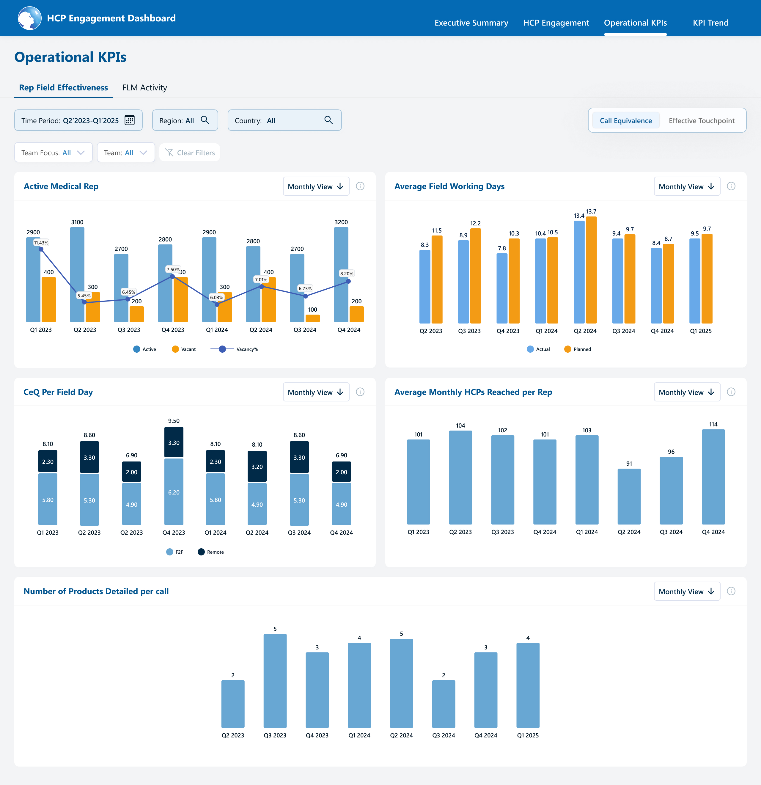
Simplify the graphs to avoid overlapping and improve clarity.
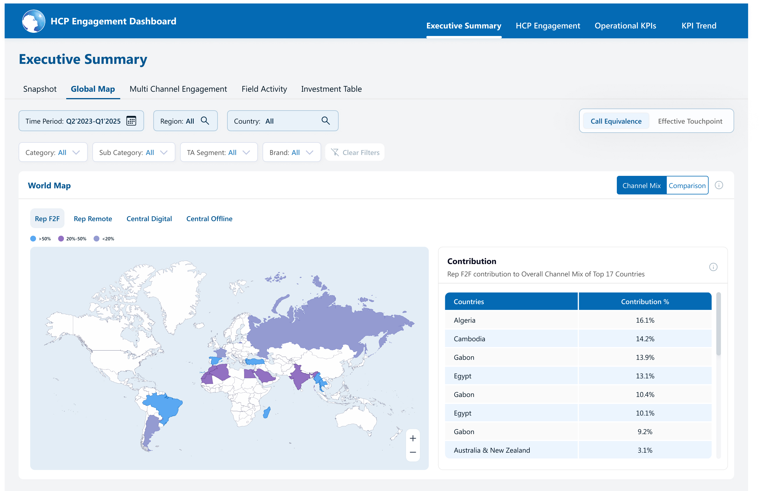
The global map is not widely used and takes up unnecessary space.
YTD vs. prior year comparisons are unclear and less actionable.

Data overload
Unused sections like Overview and Diagnostic metrics.
Reduce the number of tabs in the side panel and consolidate data into larger categories to simplify navigation.

Refining filters
Provide Category based filters instead of Team Focus
The lack of a type-to-search feature under filters makes it cumbersome for the user to search the required field

Data relevance
High level grouping in segments and categories filter, so that it’s easier for the user to view and select the necessary data points.

Navigation ease
User needed help in locating the features like export option. Enhancing the visibility of key features would simplify navigation.
User has to undergo multiple scrolling before finding the actual relevant data.

Extra features
This would eliminate the need for toggling between months and enhance efficiency.
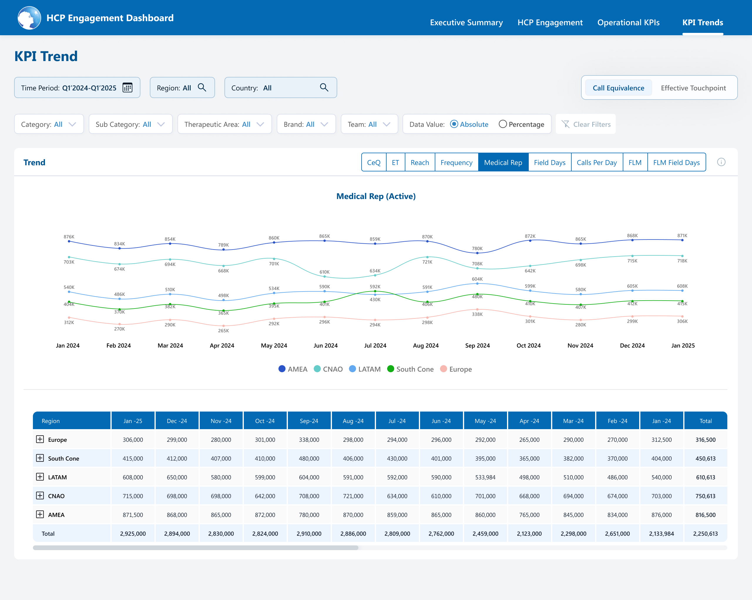
Drilling down the data to granular level allows user to identify key insights
PHASE II: STRUCTURE
With the key pain points & requirement identified, our next step was to pick the right approach to solve the challenges. Leveraging on reviews & feedback sessions from the stakeholders, we were able to add business value and make a strong impact.

Aim
Focus on key business metrics and decision-making.
Adopt a simplified navigation.
Reduce cognitive overload by streamlining data presentation
To get a cleaner, lighter design language

Approach
Simplify the information architecture to nullify redundant reports to improve clarity.
Simplify filters, optimize data access across regions and countries
Selecting a lighter colour palette to reduce visual load


Impact
Improved decision-making with streamlined and relevant data
Easier navigation and quicker access to essential information
Cleaner, more intuitive dashboard resulting in a pleasurable digital experience
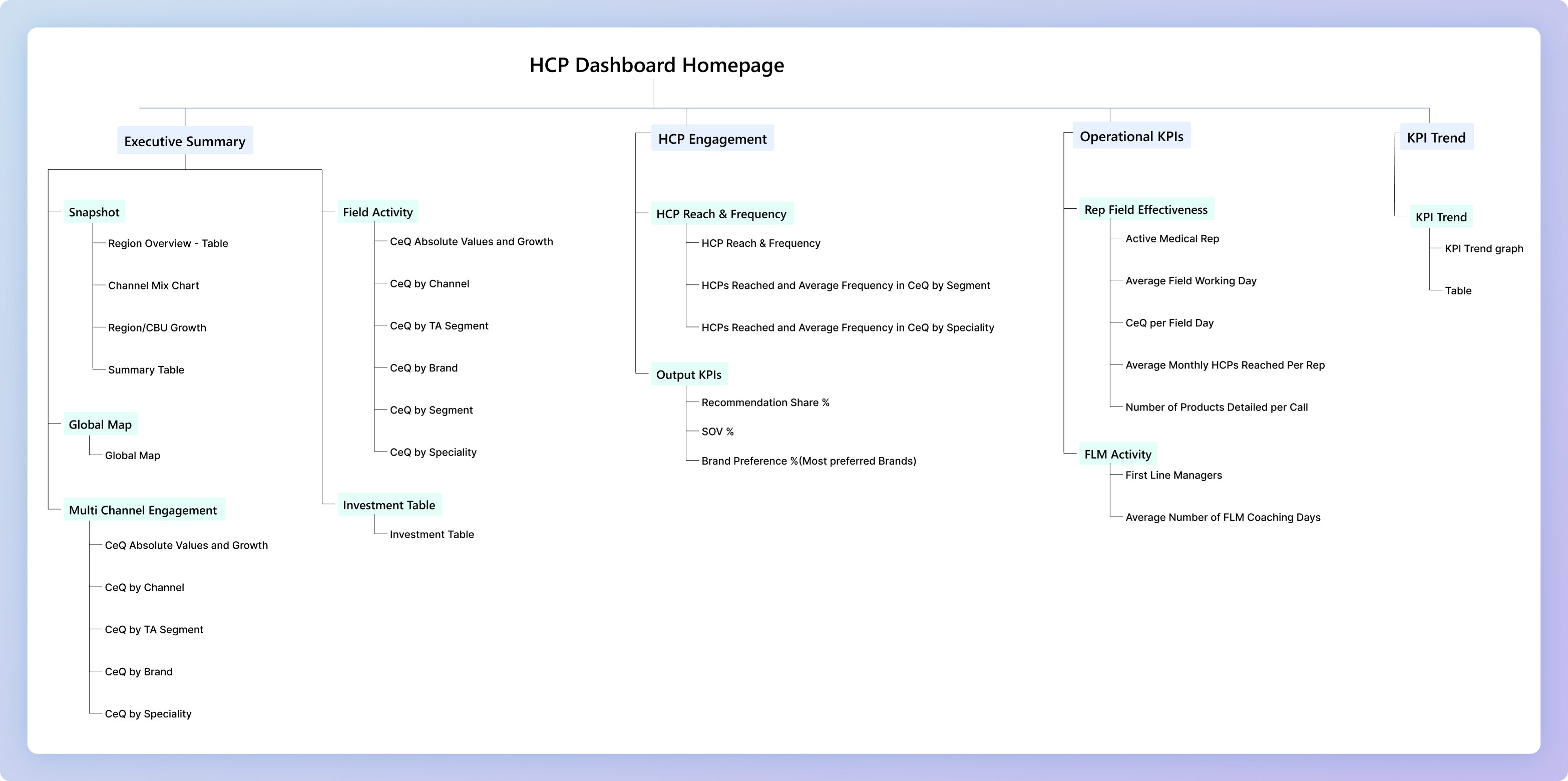
The very first thing we did to reduce data redundancy was to work on simplifying the information architecture.
SIMPLIFIED ARCHITECTURE
With all the insights and approach in place, we had a clear idea on how to progress on the designs for this dashboard.
To keep the overall design balanced and aesthetic, we created card templates to keep things consistent at production.
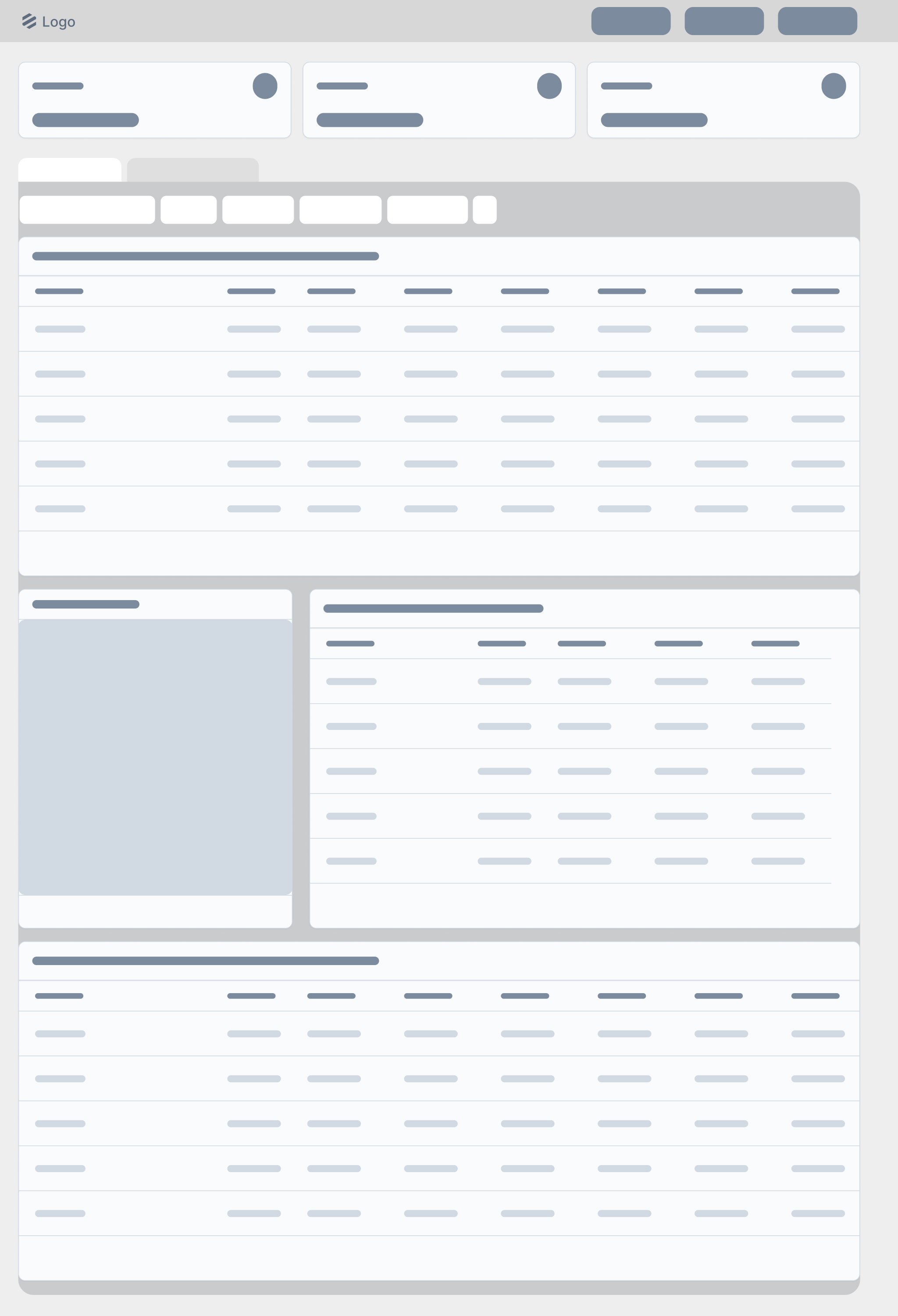
Skeleton
A standard layout (skeleton) was followed for the display of information. This ensured an intuitive experience for the users and design consistency across the page.
Card UI
Following the skeleton, we see that though two different type of information is displayed, there is visual harmony in terms of information layout and the design, making it all look cohesive.
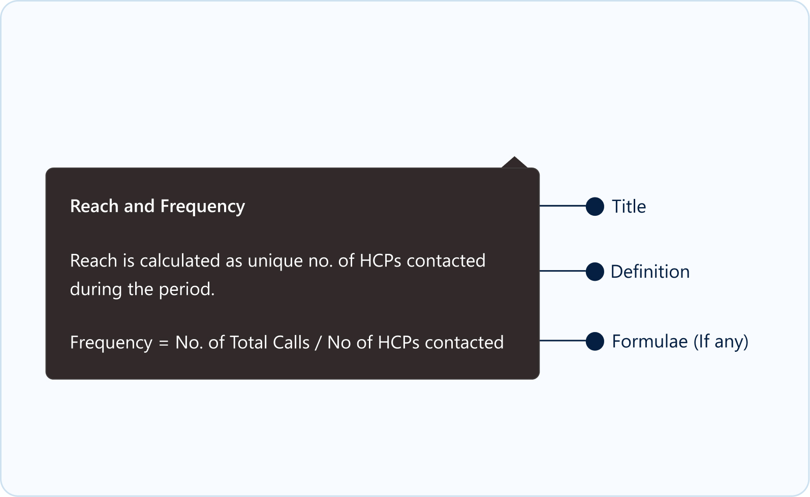
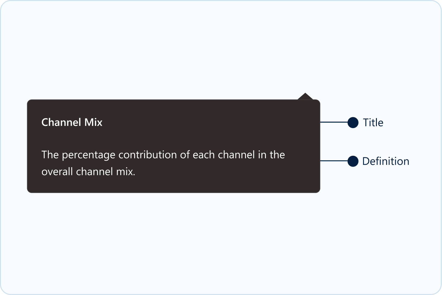
Also, to give access to information, tooltips were introduced in the dashboard. This ensured an intuitive experience for the users and design consistency across the page. It provides brief, relevant information such as descriptions, formulae, or additional supporting details, which helps clarify the feature or functionality. By offering these insights, tooltips enhance the user experience without overwhelming or cluttering the main interface.
Skeleton
Tooltip UI- Large
Tooltip UI- Small
PHASE III: DESIGNS
Power BI default font was selected as the primary font. This ensured a hassle-free production process.
Aa
Segoe UI
Heading 1
Seoge UI, 24 px, Bold
Heading 2
Seoge UI, 18 px, Bold
Heading 3
Seoge UI, 16 px, Bold
Heading 4
Seoge UI, 14 px, Bold
Tab 1
Seoge UI, 16 px, Semibold
Tab 2
Seoge UI, 14 px, Medium
Table Title
Seoge UI, 12 px, Semibold
Table Body
Seoge UI, 12 px, Regular
Background
Grey - F2F4F5
White - FFFFFF
Typography
Black - 011524
Blue - 036AB4
White - FFFFFF
Alert States
Red - E61F1F
Amber - F6BD4D
Green - 94C641
Red Light - FEE2E2
Green Light - DCFCE7
Accent Colours
Blue 1 - 1483C7
Blue 2 - 1483C7
Blue 3 - EDF5FE
Grey 1 - FAFAFA
Grey 2 - D9D9D9
Heat Map
Blue - 59A8F2
Purple - 9270C2
Light Purple - 949BD1
Page Theming
A minimalist colour palette was chosen to give the dashboards a modern, aesthetic look & feel.
#036AB4
#68A6D2
#D9D9D9
#FFFFFF
#FEE2E2
#DCFCE7
#011524
Landing Page

Predominantly grey tones with blue accents to create a visual hierarchy. The error states are not overpowering, and yet catches user attention because of proper utilization of white spaces.
Heat Map

Similar visual hierarchy maintained with the grey tones and blue accents, with the contrasts coming from heat maps where the users need to focus their attention.
Monthly HCP Data

In screens which deal with static data, a neutral colour theme is applied, and the visual hierarchy is given via font size and weights.
PHASE IV: TESTING
Usability testing was conducted to compare three navigation layouts, aiming to identify the most intuitive and user-friendly navigation. This helped us understand which layout enhances clarity, ease of access, and overall usability.
Layout 1
Aligns with the natural left-to-right flow
Can accommodate future growth without losing structure
Organised for easy access to key information
Well-structured, reducing cognitive load
Layout 2 & 3
Though being space-saving designs, users faced difficulty in identifying primary & secondary navigation
Right-aligned secondary navigation resulted in a non-intuitive & disruptive navigation experience
Sales dashboard for healthcare professionals (HCPs) to track their performance & engagement in the allocated market across APAC regions.
45+
screens

10hrs+
interviews
3
members
Made in Figma. Designed for Power BI.
PHASE I: RESEARCH
Focus on an improved digital experience for enhanced functionality.
Merge overlapping reports to streamline data presentation.
Adopt a clean design and create a cohesive visual language.
Ensure quick access to most used and relevant data metrics.
Post research and interviews, we could identify the problems and clubbed them into three main areas:
UX and Navigation Challenges
Excessive scrolling and confusing navigation structure make it difficult for users to quickly access important data.
Information Overload and Redundancy
Cluttered data presentations and repeated KPIs across sections create confusion and make it hard for users to focus on key metrics.
Design and Accessibility Issues
Inconsistent design elements and poor space utilization impact visual clarity and accessibility, making it challenging for users to find relevant information quickly.
The dashboard is now organized by data-based categories, consolidating similar KPIs and reducing redundancy.
Introduced broader categories and subcategories, reducing confusion and focusing on essential metrics.
Adopted a minimalistic design with standardized colors, typography, and icons for improved consistency and user experience.
We connected virtually with the business leads to gather their feedback on the existing dashboard, and understand the problems through 3 key areas:
Dashboard usage:
Identify the key users of the dashboard and how they utilise it for their business roles
User pain points:
Understand problem areas and identify opportunity gaps
Navigation:
Identify challenges in accessing information and explore any cognitive overload

Visualisation
Simplify the graphs to avoid overlapping and improve clarity.
The global map is not widely used and takes up unnecessary space.
YTD vs. prior year comparisons are unclear and less actionable.

Data overload
Unused sections like Overview and Diagnostic metrics.
Reduce the number of tabs in the side panel and consolidate data into larger categories to simplify navigation.

Refining filters
Provide Category based filters instead of Team Focus
The lack of a type-to-search feature under filters makes it cumbersome for the user to search the required field

Data relevance
High level grouping in segments and categories filter, so that it’s easier for the user to view and select the necessary data points.

Navigation ease
User needed help in locating the features like export option. Enhancing the visibility of key features would simplify navigation.
User has to undergo multiple scrolling before finding the actual relevant data.

Extra features
This would eliminate the need for toggling between months and enhance efficiency.
Drilling down the data to granular level allows user to identify key insights
PHASE II: STRUCTURE
With the key pain points & requirement identified, our next step was to pick the right approach to solve the challenges. Leveraging on reviews & feedback sessions from the stakeholders, we were able to add business value and make a strong impact.

Aim
Focus on key business metrics and decision-making.
Adopt a simplified navigation.
Reduce cognitive overload by streamlining data presentation
To get a cleaner, lighter design language

Approach
Simplify the information architecture to nullify redundant reports to improve clarity.
Simplify filters, optimize data access across regions and countries
Selecting a lighter colour palette to reduce visual load

Impact
Improved decision-making with streamlined and relevant data
Easier navigation and quicker access to essential information
Cleaner, more intuitive dashboard resulting in a pleasurable digital experience
The very first thing we did to reduce data redundancy was to work on simplifying the information architecture.
SIMPLIFIED ARCHITECTURE
With all the insights and approach in place, we had a clear idea on how to progress on the designs for this dashboard.
To keep the overall design balanced and aesthetic, we created card templates to keep things consistent at production.
Skeleton
A standard layout (skeleton) was followed for the display of information. This ensured an intuitive experience for the users and design consistency across the page.
Card UI
Following the skeleton, we see that though two different type of information is displayed, there is visual harmony in terms of information layout and the design, making it all look cohesive.
Also, to give access to information, tooltips were introduced in the dashboard. This ensured an intuitive experience for the users and design consistency across the page. It provides brief, relevant information such as descriptions, formulae, or additional supporting details, which helps clarify the feature or functionality. By offering these insights, tooltips enhance the user experience without overwhelming or cluttering the main interface.
Skeleton
Tooltip UI- Large
Tooltip UI- Small
PHASE III: DESIGNS
Power BI default font was selected as the primary font. This ensured a hassle-free production process.
Aa
Segoe UI
Heading 1
Seoge UI, 24 px, Bold
Heading 2
Seoge UI, 18 px, Bold
Heading 3
Seoge UI, 16 px, Bold
Heading 4
Seoge UI, 14 px, Bold
Tab 1
Seoge UI, 16 px, Semibold
Tab 2
Seoge UI, 14 px, Medium
Table Title
Seoge UI, 12 px, Semibold
Table Body
Seoge UI, 12 px, Regular
Background
Grey - F2F4F5
White - FFFFFF
Typography
Black - 011524
Blue - 036AB4
White - FFFFFF
Alert States
Red - E61F1F
Amber - F6BD4D
Green - 94C641
Red Light - FEE2E2
Green Light - DCFCE7
Accent Colours
Blue 1 - 1483C7
Blue 2 - 1483C7
Blue 3 - EDF5FE
Grey 1 - FAFAFA
Grey 2 - D9D9D9
Heat Map
Blue - 59A8F2
Purple - 9270C2
Light Purple - 949BD1
Page Theming
A minimalist colour palette was chosen to give the dashboards a modern, aesthetic look & feel.
#036AB4
#68A6D2
#D9D9D9
#FFFFFF
#FEE2E2
#DCFCE7
#011524
Landing Page
Predominantly grey tones with blue accents to create a visual hierarchy. The error states are not overpowering, and yet catches user attention because of proper utilization of white spaces.
Heat Map
Similar visual hierarchy maintained with the grey tones and blue accents, with the contrasts coming from heat maps where the users need to focus their attention.
Monthly HCP Data
In screens which deal with static data, a neutral colour theme is applied, and the visual hierarchy is given via font size and weights.
PHASE IV: TESTING
Usability testing was conducted to compare three navigation layouts, aiming to identify the most intuitive and user-friendly navigation. This helped us understand which layout enhances clarity, ease of access, and overall usability.
Layout 1
Aligns with the natural left-to-right flow
Can accommodate future growth without losing structure
Organised for easy access to key information
Well-structured, reducing cognitive load
Layout 2 & 3
Though being space-saving designs, users faced difficulty in identifying primary & secondary navigation
Right-aligned secondary navigation resulted in a non-intuitive & disruptive navigation experience
Sales dashboard for healthcare professionals (HCPs) to track their performance & engagement in the allocated market across APAC regions.
45+
screens

10hrs+
interviews
3
members
Made in Figma. Designed for Power BI.
PHASE I: RESEARCH
Focus on an improved digital experience for enhanced functionality.
Merge overlapping reports to streamline data presentation.
Adopt a clean design and create a cohesive visual language.
Ensure quick access to most used and relevant data metrics.
Post research and interviews, we could identify the problems and clubbed them into three main areas:
The dashboard is now organized by data-based categories, consolidating similar KPIs and reducing redundancy.
Introduced broader categories and subcategories, reducing confusion and focusing on essential metrics.
Adopted a minimalistic design with standardized colors, typography, and icons for improved consistency and user experience.
We connected virtually with the business leads to gather their feedback on the existing dashboard, and understand the problems through 3 key areas:

Visualisation
Simplify the graphs to avoid overlapping and improve clarity.
The global map is not widely used and takes up unnecessary space.
YTD vs. prior year comparisons are unclear and less actionable.

Data overload
Unused sections like Overview and Diagnostic metrics.
Reduce the number of tabs in the side panel and consolidate data into larger categories to simplify navigation.

Refining filters
Provide Category based filters instead of Team Focus
The lack of a type-to-search feature under filters makes it cumbersome for the user to search the required field

Data relevance
High level grouping in segments and categories filter, so that it’s easier for the user to view and select the necessary data points.

Navigation ease
User needed help in locating the features like export option. Enhancing the visibility of key features would simplify navigation.
User has to undergo multiple scrolling before finding the actual relevant data.

Extra features
This would eliminate the need for toggling between months and enhance efficiency.
Drilling down the data to granular level allows user to identify key insights
PHASE II: STRUCTURE
With the key pain points & requirement identified, our next step was to pick the right approach to solve the challenges. Leveraging on reviews & feedback sessions from the stakeholders, we were able to add business value and make a strong impact.

Aim
Focus on key business metrics and decision-making.
Adopt a simplified navigation.
Reduce cognitive overload by streamlining data presentation
To get a cleaner, lighter design language

Approach
Simplify the information architecture to nullify redundant reports to improve clarity.
Simplify filters, optimize data access across regions and countries
Selecting a lighter colour palette to reduce visual load

Impact
Improved decision-making with streamlined and relevant data
Easier navigation and quicker access to essential information
Cleaner, more intuitive dashboard resulting in a pleasurable digital experience
The very first thing we did to reduce data redundancy was to work on simplifying the information architecture.
SIMPLIFIED ARCHITECTURE
With all the insights and approach in place, we had a clear idea on how to progress on the designs for this dashboard.
To keep the overall design balanced and aesthetic, we created card templates to keep things consistent at production.
Skeleton
A standard layout (skeleton) was followed for the display of information. This ensured an intuitive experience for the users and design consistency across the page.
Card UI
Following the skeleton, we see that though two different type of information is displayed, there is visual harmony in terms of information layout and the design, making it all look cohesive.
Also, to give access to information, tooltips were introduced in the dashboard. This ensured an intuitive experience for the users and design consistency across the page. It provides brief, relevant information such as descriptions, formulae, or additional supporting details, which helps clarify the feature or functionality. By offering these insights, tooltips enhance the user experience without overwhelming or cluttering the main interface.
Skeleton
Tooltip UI- Large
Tooltip UI- Small
PHASE III: DESIGNS
Power BI default font was selected as the primary font. This ensured a hassle-free production process.
Aa
Segoe UI
Heading 1
Seoge UI, 24 px, Bold
Heading 2
Seoge UI, 18 px, Bold
Heading 3
Seoge UI, 16 px, Bold
Heading 4
Seoge UI, 14 px, Bold
Tab 1
Seoge UI, 16 px, Semibold
Tab 2
Seoge UI, 14 px, Medium
Table Title
Seoge UI, 12 px, Semibold
Table Body
Seoge UI, 12 px, Regular
Background
Grey - F2F4F5
White - FFFFFF
Typography
Black - 011524
Blue - 036AB4
White - FFFFFF
Alert States
Red - E61F1F
Amber - F6BD4D
Green - 94C641
Red Light - FEE2E2
Green Light - DCFCE7
Accent Colours
Blue 1 - 1483C7
Blue 2 - 1483C7
Blue 3 - EDF5FE
Grey 1 - FAFAFA
Grey 2 - D9D9D9
Heat Map
Blue - 59A8F2
Purple - 9270C2
Light Purple - 949BD1
Page Theming
A minimalist colour palette was chosen to give the dashboards a modern, aesthetic look & feel.
#036AB4
#68A6D2
#D9D9D9
#FFFFFF
#FEE2E2
#DCFCE7
#011524
Landing Page
Predominantly grey tones with blue accents to create a visual hierarchy. The error states are not overpowering, and yet catches user attention because of proper utilization of white spaces.
Heat Map
Similar visual hierarchy maintained with the grey tones and blue accents, with the contrasts coming from heat maps where the users need to focus their attention.
Monthly HCP Data
In screens which deal with static data, a neutral colour theme is applied, and the visual hierarchy is given via font size and weights.
PHASE IV: TESTING
Usability testing was conducted to compare three navigation layouts, aiming to identify the most intuitive and user-friendly navigation. This helped us understand which layout enhances clarity, ease of access, and overall usability.
Layout 1
Aligns with the natural left-to-right flow
Can accommodate future growth without losing structure
Organised for easy access to key information
Well-structured, reducing cognitive load
Layout 2 & 3
Though being space-saving designs, users faced difficulty in identifying primary & secondary navigation
Right-aligned secondary navigation resulted in a non-intuitive & disruptive navigation experience
Sales dashboard for healthcare professionals (HCPs) to track their performance & engagement in the allocated market across APAC regions.
45+
screens
10hrs+
interviews
3
members
Made in Figma. Designed for Power BI.
PHASE I: RESEARCH
Focus on an improved digital experience for enhanced functionality.
Merge overlapping reports to streamline data presentation.
Adopt a clean design and create a cohesive visual language.
Ensure quick access to most used and relevant data metrics.
Post research and interviews, we could identify the problems and clubbed them into three main areas:
The dashboard is now organized by data-based categories, consolidating similar KPIs and reducing redundancy.
Introduced broader categories and subcategories, reducing confusion and focusing on essential metrics.
Adopted a minimalistic design with standardized colors, typography, and icons for improved consistency and user experience.
We connected virtually with the business leads to gather their feedback on the existing dashboard, and understand the problems through 3 key areas:

Visualisation
Simplify the graphs to avoid overlapping and improve clarity.
The global map is not widely used and takes up unnecessary space.
YTD vs. prior year comparisons are unclear and less actionable.

Data overload
Unused sections like Overview and Diagnostic metrics.
Reduce the number of tabs in the side panel and consolidate data into larger categories to simplify navigation.

Refining filters
Provide Category based filters instead of Team Focus
The lack of a type-to-search feature under filters makes it cumbersome for the user to search the required field

Data relevance
High level grouping in segments and categories filter, so that it’s easier for the user to view and select the necessary data points.

Navigation ease
User needed help in locating the features like export option. Enhancing the visibility of key features would simplify navigation.
User has to undergo multiple scrolling before finding the actual relevant data.

Extra features
This would eliminate the need for toggling between months and enhance efficiency.
Drilling down the data to granular level allows user to identify key insights
PHASE II: STRUCTURE
With the key pain points & requirement identified, our next step was to pick the right approach to solve the challenges. Leveraging on reviews & feedback sessions from the stakeholders, we were able to add business value and make a strong impact.
Aim
Focus on key business metrics and decision-making.
Adopt a simplified navigation.
Reduce cognitive overload by streamlining data presentation
To get a cleaner, lighter design language
Approach
Simplify the information architecture to nullify redundant reports to improve clarity.
Simplify filters, optimize data access across regions and countries
Selecting a lighter colour palette to reduce visual load
Impact
Improved decision-making with streamlined and relevant data
Easier navigation and quicker access to essential information
Cleaner, more intuitive dashboard resulting in a pleasurable digital experience
The very first thing we did to reduce data redundancy was to work on simplifying the information architecture.
SIMPLIFIED ARCHITECTURE
With all the insights and approach in place, we had a clear idea on how to progress on the designs for this dashboard.
To keep the overall design balanced and aesthetic, we created card templates to keep things consistent at production.
Skeleton
A standard layout (skeleton) was followed for the display of information. This ensured an intuitive experience for the users and design consistency across the page.
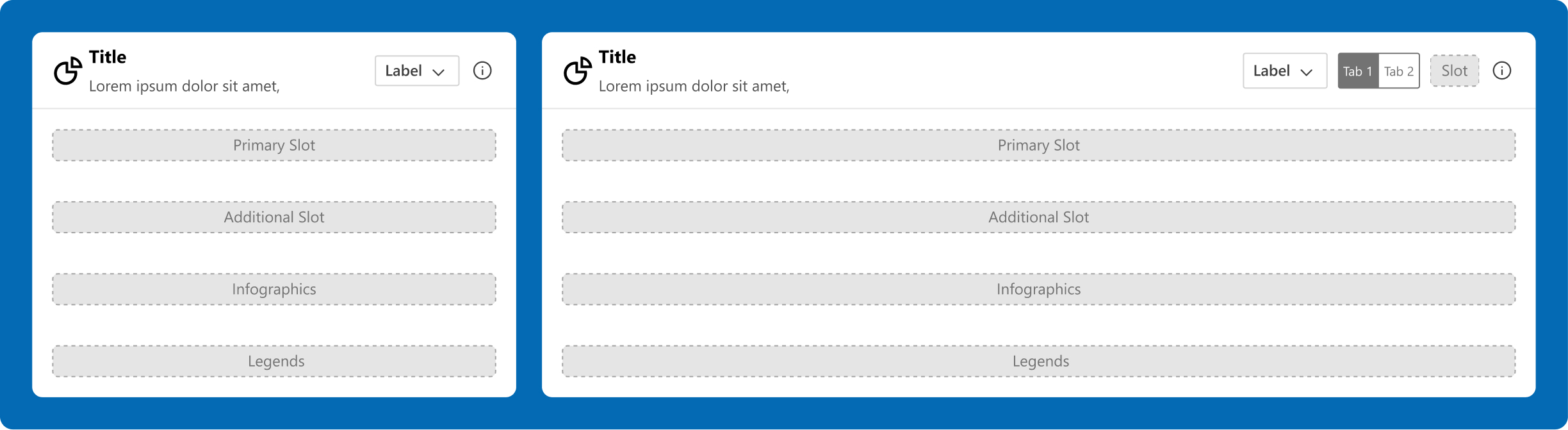
Card UI
Following the skeleton, we see that though two different type of information is displayed, there is visual harmony in terms of information layout and the design, making it all look cohesive.
Also, to give access to information, tooltips were introduced in the dashboard. This ensured an intuitive experience for the users and design consistency across the page. It provides brief, relevant information such as descriptions, formulae, or additional supporting details, which helps clarify the feature or functionality. By offering these insights, tooltips enhance the user experience without overwhelming or cluttering the main interface.
Skeleton
Tooltip UI- Large
Tooltip UI- Small
PHASE III: DESIGNS
Power BI default font was selected as the primary font. This ensured a hassle-free production process.
Aa
Segoe UI
Heading 1
Seoge UI, 24 px, Bold
Heading 2
Seoge UI, 18 px, Bold
Heading 3
Seoge UI, 16 px, Bold
Heading 4
Seoge UI, 14 px, Bold
Tab 1
Seoge UI, 16 px, Semibold
Tab 2
Seoge UI, 14 px, Medium
Table Title
Seoge UI, 12 px, Semibold
Table Body
Seoge UI, 12 px, Regular
Background
Grey - F2F4F5
White - FFFFFF
Typography
Black - 011524
Blue - 036AB4
White - FFFFFF
Alert States
Red - E61F1F
Amber - F6BD4D
Green - 94C641
Red Light - FEE2E2
Green Light - DCFCE7
Accent Colours
Blue 1 - 1483C7
Blue 2 - 1483C7
Blue 3 - EDF5FE
Grey 1 - FAFAFA
Grey 2 - D9D9D9
Heat Map
Blue - 59A8F2
Purple - 9270C2
Light Purple - 949BD1
Page Theming
A minimalist colour palette was chosen to give the dashboards a modern, aesthetic look & feel.
#036AB4
#68A6D2
#D9D9D9
#FFFFFF
#FEE2E2
#DCFCE7
#011524
Landing Page
Predominantly grey tones with blue accents to create a visual hierarchy. The error states are not overpowering, and yet catches user attention because of proper utilization of white spaces.
Heat Map
Similar visual hierarchy maintained with the grey tones and blue accents, with the contrasts coming from heat maps where the users need to focus their attention.
Monthly HCP Data
In screens which deal with static data, a neutral colour theme is applied, and the visual hierarchy is given via font size and weights.
PHASE IV: TESTING
Usability testing was conducted to compare three navigation layouts, aiming to identify the most intuitive and user-friendly navigation. This helped us understand which layout enhances clarity, ease of access, and overall usability.
Layout 1
Aligns with the natural left-to-right flow
Can accommodate future growth without losing structure
Organised for easy access to key information
Well-structured, reducing cognitive load
Layout 2 & 3
Though being space-saving designs, users faced difficulty in identifying primary & secondary navigation
Right-aligned secondary navigation resulted in a non-intuitive & disruptive navigation experience
Sales dashboard for healthcare professionals (HCPs) to track their performance & engagement in the allocated market across APAC regions.
45+
screens
10hrs+
interviews
3
members
Made in Figma. Designed for Power BI.
PHASE I: RESEARCH
Focus on an improved digital experience for enhanced functionality.
Merge overlapping reports to streamline data presentation.
Adopt a clean design and create a cohesive visual language.
Ensure quick access to most used and relevant data metrics.
Post research and interviews, we could identify the problems and clubbed them into three main areas:
The dashboard is now organized by data-based categories, consolidating similar KPIs and reducing redundancy.
Introduced broader categories and subcategories, reducing confusion and focusing on essential metrics.
Adopted a minimalistic design with standardized colors, typography, and icons for improved consistency and user experience.
We connected virtually with the business leads to gather their feedback on the existing dashboard, and understand the problems through 3 key areas:
Visualisation
Simplify the graphs to avoid overlapping and improve clarity.
The global map is not widely used and takes up unnecessary space.
YTD vs. prior year comparisons are unclear and less actionable.
Data overload
Unused sections like Overview and Diagnostic metrics.
Reduce the number of tabs in the side panel and consolidate data into larger categories to simplify navigation.
Refining filters
Provide Category based filters instead of Team Focus
The lack of a type-to-search feature under filters makes it cumbersome for the user to search the required field
Data relevance
High level grouping in segments and categories filter, so that it’s easier for the user to view and select the necessary data points.
Navigation ease
User needed help in locating the features like export option. Enhancing the visibility of key features would simplify navigation.
User has to undergo multiple scrolling before finding the actual relevant data.
Extra features
This would eliminate the need for toggling between months and enhance efficiency.
Drilling down the data to granular level allows user to identify key insights
PHASE II: STRUCTURE
With the key pain points & requirement identified, our next step was to pick the right approach to solve the challenges. Leveraging on reviews & feedback sessions from the stakeholders, we were able to add business value and make a strong impact.
Aim
Focus on key business metrics and decision-making.
Adopt a simplified navigation.
Reduce cognitive overload by streamlining data presentation
To get a cleaner, lighter design language
Approach
Simplify the information architecture to nullify redundant reports to improve clarity.
Simplify filters, optimize data access across regions and countries
Selecting a lighter colour palette to reduce visual load
Impact
Improved decision-making with streamlined and relevant data
Easier navigation and quicker access to essential information
Cleaner, more intuitive dashboard resulting in a pleasurable digital experience
The very first thing we did to reduce data redundancy was to work on simplifying the information architecture.
SIMPLIFIED ARCHITECTURE
With all the insights and approach in place, we had a clear idea on how to progress on the designs for this dashboard.
To keep the overall design balanced and aesthetic, we created card templates to keep things consistent at production.
Skeleton
A standard layout (skeleton) was followed for the display of information. This ensured an
intuitive experience for the users and design consistency across the page.
Card UI
Following the skeleton, we see that though two different type of information is displayed, there
is visual harmony in terms of information layout and the design, making it all look cohesive.
Also, to give access to information, tooltips were introduced in the dashboard. This ensured an intuitive experience for the users and design consistency across the page. It provides brief, relevant information such as descriptions, formulae, or additional supporting details, which helps clarify the feature or functionality. By offering these insights, tooltips enhance the user experience without overwhelming or cluttering the main interface.
Skeleton
Tooltip UI- Large
Tooltip UI- Small
PHASE III: DESIGNS
Power BI default font was selected as the primary font. This ensured a hassle-free production process.
Aa
Segoe UI
Heading 1
Seoge UI, 24 px, Bold
Heading 2
Seoge UI, 18 px, Bold
Heading 3
Seoge UI, 16 px, Bold
Heading 4
Seoge UI, 14 px, Bold
Tab 1
Seoge UI, 16 px, Semibold
Tab 2
Seoge UI, 14 px, Medium
Table Title
Seoge UI, 12 px, Semibold
Table Body
Seoge UI, 12 px, Regular
Background
Grey - F2F4F5
White - FFFFFF
Typography
Black - 011524
Blue - 036AB4
White - FFFFFF
Alert States
Red - E61F1F
Amber - F6BD4D
Green - 94C641
Red Light - FEE2E2
Green Light - DCFCE7
Accent Colours
Blue 1 - 1483C7
Blue 2 - 1483C7
Blue 3 - EDF5FE
Grey 1 - FAFAFA
Grey 2 - D9D9D9
Heat Map
Blue - 59A8F2
Purple - 9270C2
Light Purple - 949BD1
Page Theming
A minimalist colour palette was chosen to give the dashboards a modern, aesthetic look & feel.
#036AB4
#68A6D2
#D9D9D9
#FFFFFF
#FEE2E2
#DCFCE7
#011524
Landing Page
Predominantly grey tones with blue accents to create a visual hierarchy. The error states are not overpowering, and yet catches user attention because of proper utilization of white spaces.
Heat Map
Similar visual hierarchy maintained with the grey tones and blue accents, with the contrasts coming from heat maps where the users need to focus their attention.
Monthly HCP Data
In screens which deal with static data, a neutral colour theme is applied, and the visual hierarchy is given via font size and weights.
PHASE IV: TESTING
Usability testing was conducted to compare three navigation layouts, aiming to identify the most intuitive and user-friendly navigation. This helped us understand which layout enhances clarity, ease of access, and overall usability.
Layout 1
Aligns with the natural left-to-right flow
Can accommodate future growth without losing structure
Organised for easy access to key information
Well-structured, reducing cognitive load
Layout 2 & 3
Though being space-saving designs, users faced difficulty in identifying primary & secondary navigation
Right-aligned secondary navigation resulted in a non-intuitive & disruptive navigation experience