


Abbott
A unified dashboard to monitor business health across Pacific Asia, combining key metrics and visual insights with peer comparisons.
20+
metrics

14
regions
4
members
Made in Figma. Designed for Power BI.


PREFACE
Objective
Post research and interviews, we could identify the problems and clubbed them into three main areas:
UX and Navigation Challenges
Excessive scrolling and confusing navigation structure make it difficult for users to quickly access important data.
Information Overload and Redundancy
Cluttered data presentations and repeated KPIs across sections create confusion and make it hard for users to focus on key metrics.
Design and Accessibility Issues
Inconsistent design elements and poor space utilization impact visual clarity and accessibility, making it challenging for users to find relevant information quickly.

Expectations
Support affiliate commercial leaders to review SFE & Training metrics across channel by month & YTD.
Enable leads to discuss KPIs with respective channel leads to drive productivity
Stakeholders
- Vice President
- Deputy Vice-President
- Country General Manager
- Sales Heads
- Marketing Heads
- Commercial Excellence Leads
Data Source
- Ethcal SFE KPIs
- Trade SFE KPIs
- Training KPIs
Publication
Published on third week of every month
Communication are made via automated mail containing the Power BI report link to all stakeholders
User Pain points
The clients were quite clear that there won’t be any direct interaction with the end users, so the main source of gathering user data & pain points was through forms and surveys. Once collated, all pain points could largely be clubbed under three requirements, which gave us the next directions.

Information access
Clients:
We need to view the logics & thresholds of the KPIs.
Inference:
Better information architecture & easy access to all relevant information.

Sync status
Clients:
Is the data displayed in the dashboards up to date?
Inference:
Time-stamps to display the data loading & refresh time.

Visualisation
Clients:
We are getting the information, but can it look better?
Inference:
Aesthetic & decluttered visuals for information display.
Dashboard usage
With the stakeholders using a common dashboard, it was imperative to identify the distinct needs of the Global Directors and General Managers, while also showing where their focus areas overlap—capturing both individual requirements and the common insights they rely on.
Global Directors
Set plan for upcoming month based on current month data
To check overall performance of PA countries
To check performance of General Managers respective regions
Common Goals
Usage during PA Regional meets to check overall performance of PA region
Identify & focus on underperforming countries
Usage during internal monthly meets to discuss next course of actions
Quick access to relevant information within the same reports
General Managers
To check countrywise performance of their assigned regions
Early forecasting of shortcomings & proactive mitigation
IMPACT
Business value
With the key pain points & requirement identified, our next step was to pick the right approach to solve the challenges. Leveraging on reviews & feedback sessions from the stakeholders, we were able to add business value and make a strong impact.

Aim
To provide focus areas for information display
To minimize clutter across reports
To enhance look & feel of the report designs

Approach
Introduce global navigation tabs across reports
Efficient use of tool tips to display secondary information
Revisit information architecture across reports
Alternate arrangement for layout of information
Use of a clean, minimal & relevant design system
Standardizing color guidelines across reports


Impact
Quick, easy access to information
Clean, visually balanced reports
Modern, aesthetic dashboard designs
Screen Comparisons
Home Page
Older screen (left)
Excel-like visuals with no visual balance
No color harmony, and parameter groupings not prominent
Absence of an intuitive navigation to country-wise One Page Summary
Cluttered layout of content heavy information
Last Refresh data not available
Redesigned screen (right)
More modern & aesthetic layout
Optimized usage color with ample negative spaces
Easy navigation- either specific to a country, or generally across the reports
Presence of quick information cards at the top to give an overall lay of land
Quick access to Last Refresh data

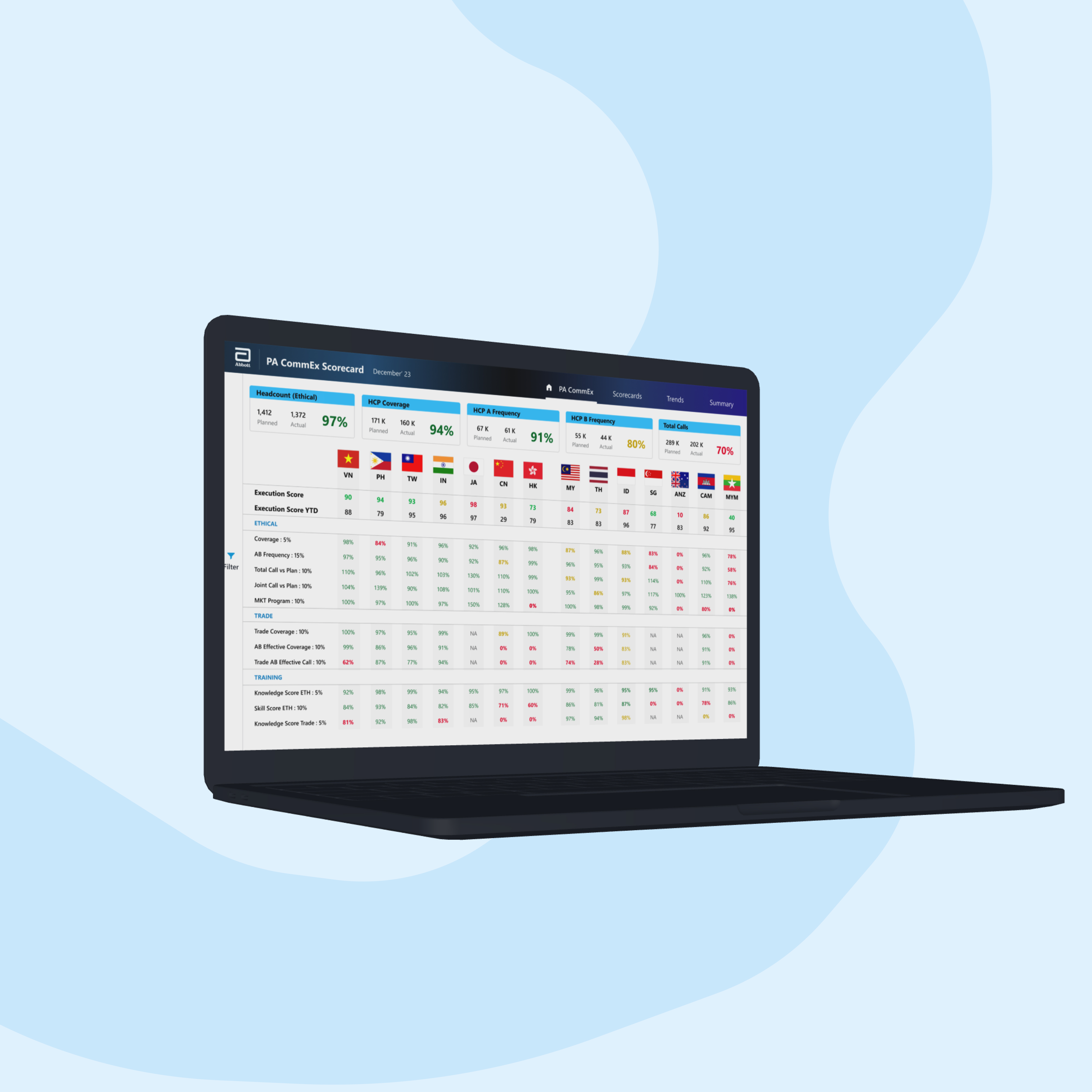
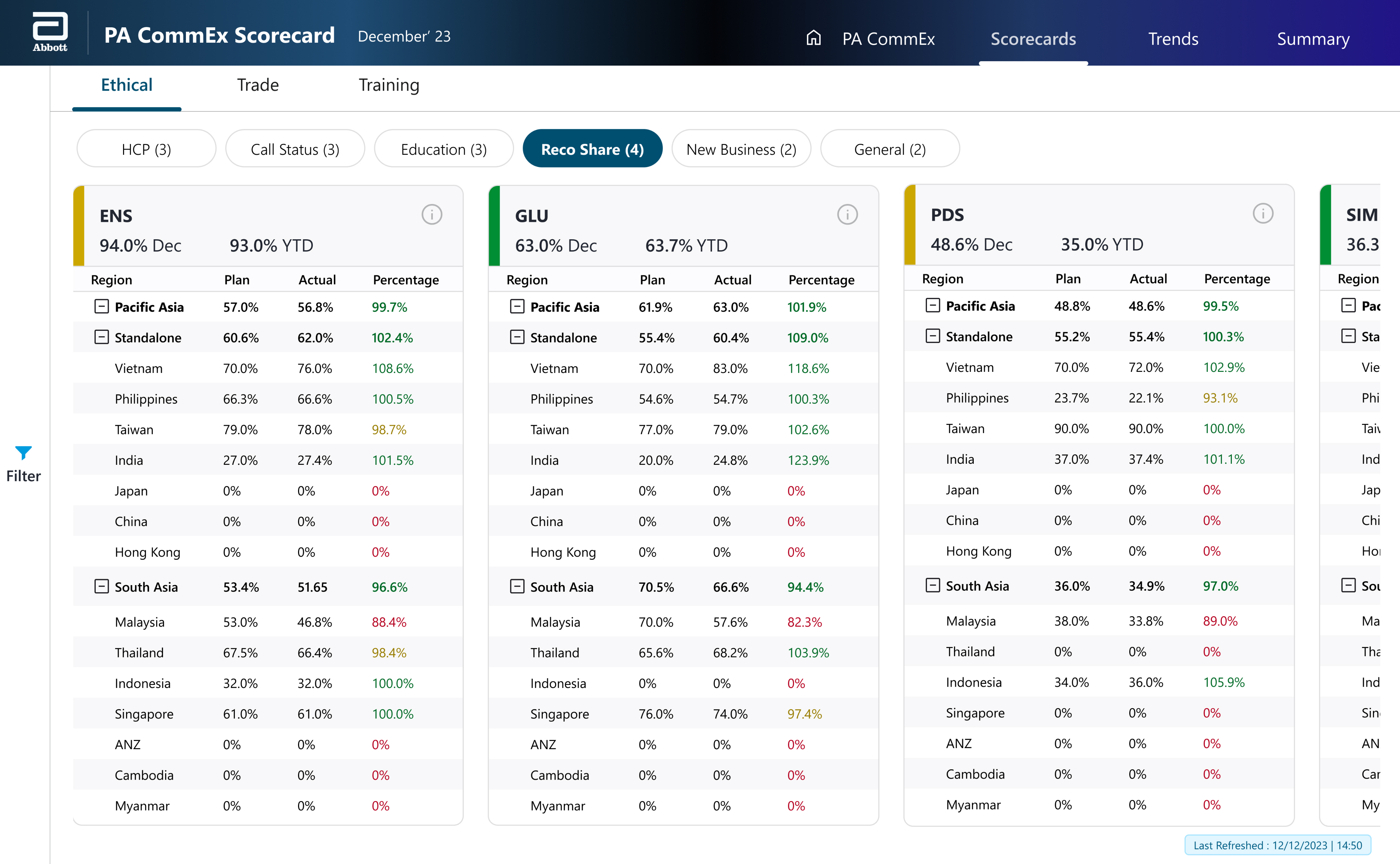
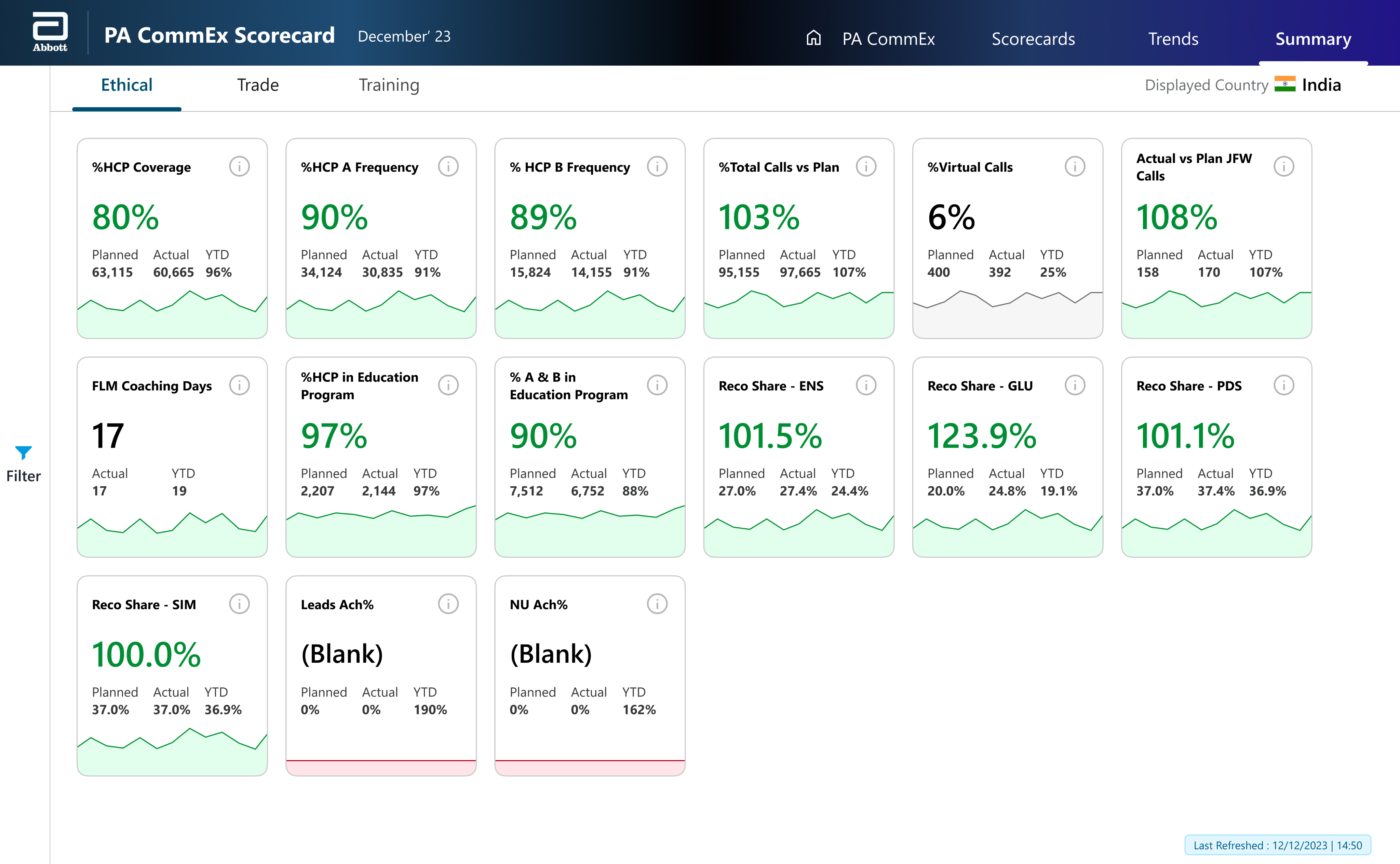
Scorecards
Older screen (left)
Cluttered layout in a compact space
No clear information grouping or hierarchy in place
Usage of odd sized iconography to denote the status of each country/ region
Overall Status of the each KPI is not prominent enough in the accent bar
No way to access additional information like threshold value
Redesigned screen (right)
Better usage of screen space for displaying the KPI cards
Information grouping via sub-navigation & KPI pills for a better focus area
More prominent accent bars displaying the status of each KPI
Information icon & tool-tips to give quick access to secondary level of information like KPI definition, threshold value, range etc.
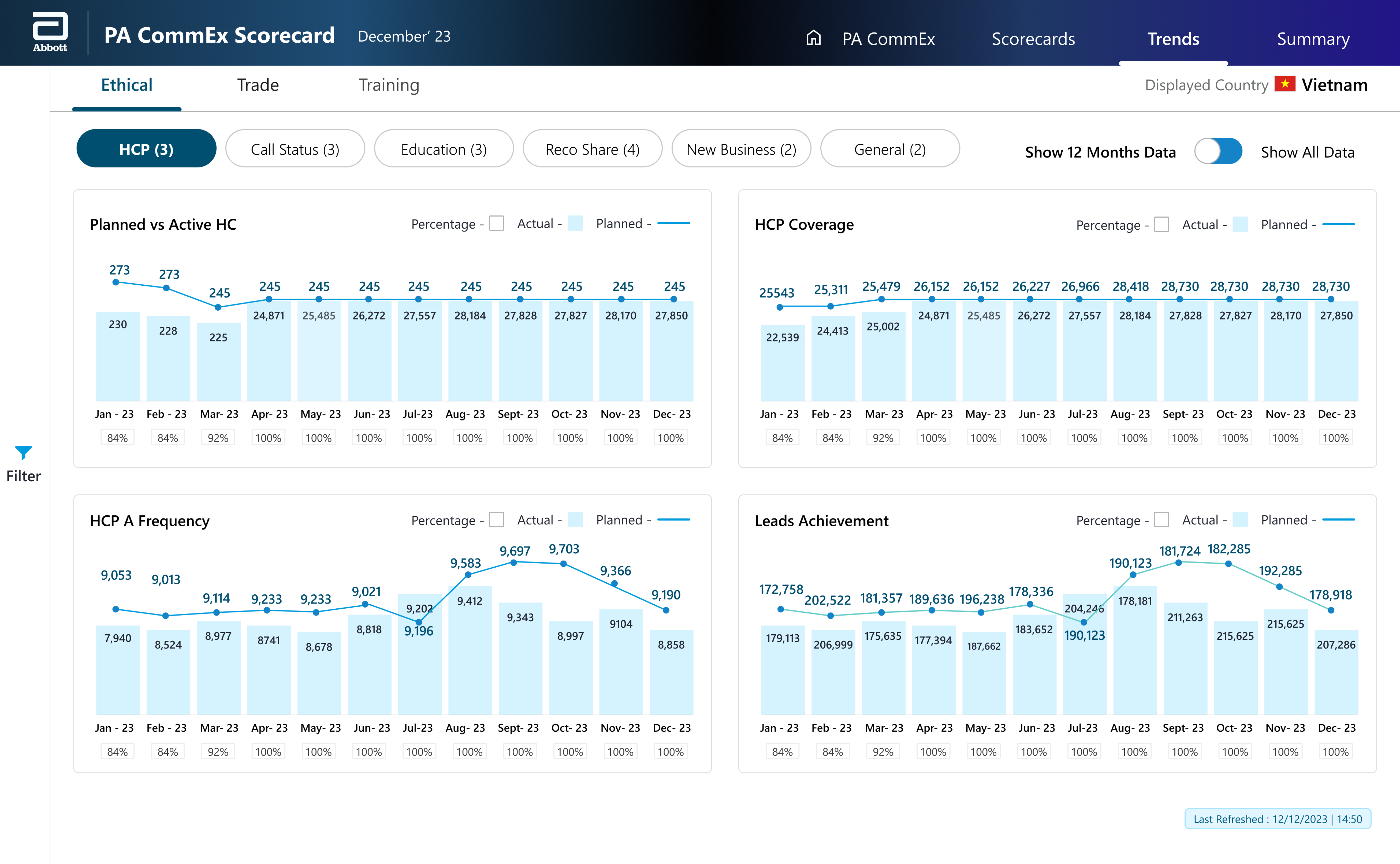
Monthly Trend Analysis
Older screen (left)
Mismatch between graph legends and actual bar graphs
No grouping of information, and hence all graphs are displayed in one place with lengthy scrolling
For percentage display, transparent backdrop with low contrast colors may cause eye strain to users
Redesigned screen (right)
Uniform color for bar graphs, resulting in easier association of data
Grouping of information in sub-navigation panel results in more focused viewing areas with lesser scroll lengths
Pleasant color for graphs makes for easy access to figures without any strain
One Page Summary
Older screen (left)
Confusing navigation in terms of KPI-Country toggle, with no intuitive way of returning to current screen
Absence of information grouping
Currently, accent bars are the only way to track changes over a period
KPI title does not have clear prominence within the information displayed
Redesigned screen (right)
Information grouping via sub-navigation & for a better focus area & data absorption
Color coded status cards with KPI trend to give
a more holistic view
Information icon & tool-tips to give quick access to secondary level of information like KPI definition, threshold value, range
Larger display of data results in a better viewing experience
DESIGNS
Considerations
Since the screens were designed in Figma specifically for the Power BI platform, we had to follow platform-driven design constraints from the outset. Working within limitations related to typography, screen dimensions, and production layout, along with a strict branding constraint from the stakeholders made it a creatively challenging project.
Aa
Segoe UI
Callout
28 px, Bold
Navigation
16 px, Semibold
Headers
14 px, Bold
Captions
12 px, Semibold
Body
12 px, Regular
Screen Size
1280x720
004F71
Pills & Indicators
009CDE
Accents
D4F2FF
Accents- Light
F9F9F9
Natural Grey
FFFFFF
Background
000000
Typography
008E33
Success
E1FFEC
Success- Light
CCA700
Caution
FFFBE8
Caution- Light
E40028
Error
FFE5EA
Error- Light
Abbott
A unified dashboard to monitor business health across Pacific Asia, combining key metrics and visual insights with peer comparisons.
20+
metrics

14
regions
4
members
Made in Figma. Designed for Power BI.
PREFACE
Objective
Post research and interviews, we could identify the problems and clubbed them into three main areas:
UX and Navigation Challenges
Excessive scrolling and confusing navigation structure make it difficult for users to quickly access important data.
Information Overload and Redundancy
Cluttered data presentations and repeated KPIs across sections create confusion and make it hard for users to focus on key metrics.
Design and Accessibility Issues
Inconsistent design elements and poor space utilization impact visual clarity and accessibility, making it challenging for users to find relevant information quickly.
Expectations
Support affiliate commercial leaders to review SFE & Training metrics across channel by month & YTD.
Enable leads to discuss KPIs with respective channel leads to drive productivity
Stakeholders
- Vice President
- Deputy Vice-President
- Country General Manager
- Sales Heads
- Marketing Heads
- Commercial Excellence Leads
Data Source
- Ethcal SFE KPIs
- Trade SFE KPIs
- Training KPIs
Publication
Published on third week of every month
Communication are made via automated mail containing the Power BI report link to all stakeholders
User Pain points
The clients were quite clear that there won’t be any direct interaction with the end users, so the main source of gathering user data & pain points was through forms and surveys. Once collated, all pain points could largely be clubbed under three requirements, which gave us the next directions.

Information access
Clients:
We need to view the logics & thresholds of the KPIs.
Inference:
Better information architecture & easy access to all relevant information.

Sync status
Clients:
Is the data displayed in the dashboards up to date?
Inference:
Time-stamps to display the data loading & refresh time.

Visualisation
Clients:
We are getting the information, but can it look better?
Inference:
Aesthetic & decluttered visuals for information display.
Dashboard usage
With the stakeholders using a common dashboard, it was imperative to identify the distinct needs of the Global Directors and General Managers, while also showing where their focus areas overlap—capturing both individual requirements and the common insights they rely on.
Global Directors
Set plan for upcoming month based on current month data
To check overall performance of PA countries
To check performance of General Managers respective regions
Common Goals
Usage during PA Regional meets to check overall performance of PA region
Identify & focus on underperforming countries
Usage during internal monthly meets to discuss next course of actions
Quick access to relevant information within the same reports
General Managers
To check countrywise performance of their assigned regions
Early forecasting of shortcomings & proactive mitigation
IMPACT
Business value
With the key pain points & requirement identified, our next step was to pick the right approach to solve the challenges. Leveraging on reviews & feedback sessions from the stakeholders, we were able to add business value and make a strong impact.

Aim
To provide focus areas for information display
To minimize clutter across reports
To enhance look & feel of the report designs

Approach
Introduce global navigation tabs across reports
Efficient use of tool tips to display secondary information
Revisit information architecture across reports
Alternate arrangement for layout of information
Use of a clean, minimal & relevant design system
Standardizing color guidelines across reports

Impact
Quick, easy access to information
Clean, visually balanced reports
Modern, aesthetic dashboard designs
Screen Comparisons
Home Page
Older screen (left)
Excel-like visuals with no visual balance
No color harmony, and parameter groupings not prominent
Absence of an intuitive navigation to country-wise One Page Summary
Cluttered layout of content heavy information
Last Refresh data not available
Redesigned screen (right)
More modern & aesthetic layout
Optimized usage color with ample negative spaces
Easy navigation- either specific to a country, or generally across the reports
Presence of quick information cards at the top to give an overall lay of land
Quick access to Last Refresh data

Scorecards
Older screen (left)
Cluttered layout in a compact space
No clear information grouping or hierarchy in place
Usage of odd sized iconography to denote the status of each country/ region
Overall Status of the each KPI is not prominent enough in the accent bar
No way to access additional information like threshold value
Redesigned screen (right)
Better usage of screen space for displaying the KPI cards
Information grouping via sub-navigation & KPI pills for a better focus area
More prominent accent bars displaying the status of each KPI
Information icon & tool-tips to give quick access to secondary level of information like KPI definition, threshold value, range etc.
Monthly Trend Analysis
Older screen (left)
Mismatch between graph legends and actual bar graphs
No grouping of information, and hence all graphs are displayed in one place with lengthy scrolling
For percentage display, transparent backdrop with low contrast colors may cause eye strain to users
Redesigned screen (right)
Uniform color for bar graphs, resulting in easier association of data
Grouping of information in sub-navigation panel results in more focused viewing areas with lesser scroll lengths
Pleasant color for graphs makes for easy access to figures without any strain
One Page Summary
Older screen (left)
Confusing navigation in terms of KPI-Country toggle, with no intuitive way of returning to current screen
Absence of information grouping
Currently, accent bars are the only way to track changes over a period
KPI title does not have clear prominence within the information displayed
Redesigned screen (right)
Information grouping via sub-navigation & for a better focus area & data absorption
Color coded status cards with KPI trend to give
a more holistic view
Information icon & tool-tips to give quick access to secondary level of information like KPI definition, threshold value, range
Larger display of data results in a better viewing experience
DESIGNS
Considerations
Since the screens were designed in Figma specifically for the Power BI platform, we had to follow platform-driven design constraints from the outset. Working within limitations related to typography, screen dimensions, and production layout, along with a strict branding constraint from the stakeholders made it a creatively challenging project.
Aa
Segoe UI
Callout
28 px, Bold
Navigation
16 px, Semibold
Headers
14 px, Bold
Captions
12 px, Semibold
Body
12 px, Regular
Screen Size
1280x720
004F71
Pills & Indicators
009CDE
Accents
D4F2FF
Accents- Light
F9F9F9
Natural Grey
FFFFFF
Background
000000
Typography
008E33
Success
E1FFEC
Success- Light
CCA700
Caution
FFFBE8
Caution- Light
E40028
Error
FFE5EA
Error- Light
Abbott
A unified dashboard to monitor business health across Pacific Asia, combining key metrics and visual insights with peer comparisons.
20+
metrics

14
regions
4
members
Made in Figma. Designed for Power BI.
PREFACE
Objective
Provide a framework to monitor the health of business through various metrics across Pacific Asia markets. The dashboard brings various parameters in one place with visualisation to enable insights & compare data with peer groups.
Expectations
Support affiliate commercial leaders to review SFE & Training metrics across channel by month & YTD.
Enable leads to discuss KPIs with respective channel leads to drive productivity
Stakeholders
- Vice President
- Deputy Vice-President
- Country General Manager
- Sales Heads
- Marketing Heads
- Commercial Excellence Leads
Data Source
- Ethcal SFE KPIs
- Trade SFE KPIs
- Training KPIs
Publication
Published on third week of every month
Communication are made via automated mail containing the Power BI report link to all stakeholders
User Pain points
The clients were quite clear that there won’t be any direct interaction with the end users, so the main source of gathering user data & pain points was through forms and surveys. Once collated, all pain points could largely be clubbed under three requirements, which gave us the next directions.

Information access
Clients:
We need to view the logics & thresholds of the KPIs.
Inference:
Better information architecture & easy access to all relevant information.

Sync status
Clients:
Is the data displayed in the dashboards up to date?
Inference:
Time-stamps to display the data loading & refresh time.

Visualisation
Clients:
We are getting the information, but can it look better?
Inference:
Aesthetic & decluttered visuals for information display.
Dashboard usage
With the stakeholders using a common dashboard, it was imperative to identify the distinct needs of the Global Directors and General Managers, while also showing where their focus areas overlap—capturing both individual requirements and the common insights they rely on.
Global Directors
Set plan for upcoming month based on current month data
To check overall performance of PA countries
To check performance of General Managers respective regions
Common Goals
Usage during PA Regional meets to check overall performance of PA region
Identify & focus on underperforming countries
Usage during internal monthly meets to discuss next course of actions
Quick access to relevant information within the same reports
General Managers
To check countrywise performance of their assigned regions
Early forecasting of shortcomings & proactive mitigation
IMPACT
Business value
With the key pain points & requirement identified, our next step was to pick the right approach to solve the challenges. Leveraging on reviews & feedback sessions from the stakeholders, we were able to add business value and make a strong impact.

Aim
To provide focus areas for information display
To minimize clutter across reports
To enhance look & feel of the report designs

Approach
Introduce global navigation tabs across reports
Efficient use of tool tips to display secondary information
Revisit information architecture across reports
Alternate arrangement for layout of information
Use of a clean, minimal & relevant design system
Standardizing color guidelines across reports

Impact
Quick, easy access to information
Clean, visually balanced reports
Modern, aesthetic dashboard designs
Screen Comparisons
Home Page
Older screen (left)
Excel-like visuals with no visual balance
No color harmony, and parameter groupings not prominent
Absence of an intuitive navigation to country-wise One Page Summary
Cluttered layout of content heavy information
Last Refresh data not available
Redesigned screen (right)
More modern & aesthetic layout
Optimized usage color with ample negative spaces
Easy navigation- either specific to a country, or generally across the reports
Presence of quick information cards at the top to give an overall lay of land
Quick access to Last Refresh data

Scorecards
Older screen (left)
Cluttered layout in a compact space
No clear information grouping or hierarchy in place
Usage of odd sized iconography to denote the status of each country/ region
Overall Status of the each KPI is not prominent enough in the accent bar
No way to access additional information like threshold value
Redesigned screen (right)
Better usage of screen space for displaying the KPI cards
Information grouping via sub-navigation & KPI pills for a better focus area
More prominent accent bars displaying the status of each KPI
Information icon & tool-tips to give quick access to secondary level of information like KPI definition, threshold value, range etc.
Monthly Trend Analysis
Older screen (left)
Mismatch between graph legends and actual bar graphs
No grouping of information, and hence all graphs are displayed in one place with lengthy scrolling
For percentage display, transparent backdrop with low contrast colors may cause eye strain to users
Redesigned screen (right)
Uniform color for bar graphs, resulting in easier association of data
Grouping of information in sub-navigation panel results in more focused viewing areas with lesser scroll lengths
Pleasant color for graphs makes for easy access to figures without any strain
One Page Summary
Older screen (left)
Confusing navigation in terms of KPI-Country toggle, with no intuitive way of returning to current screen
Absence of information grouping
Currently, accent bars are the only way to track changes over a period
KPI title does not have clear prominence within the information displayed
Redesigned screen (right)
Information grouping via sub-navigation & for a better focus area & data absorption
Color coded status cards with KPI trend to give
a more holistic view
Information icon & tool-tips to give quick access to secondary level of information like KPI definition, threshold value, range
Larger display of data results in a better viewing experience
DESIGNS
Considerations
Since the screens were designed in Figma specifically for the Power BI platform, we had to follow platform-driven design constraints from the outset. Working within limitations related to typography, screen dimensions, and production layout, along with a strict branding constraint from the stakeholders made it a creatively challenging project.
Aa
Segoe UI
Callout
28 px, Bold
Navigation
16 px, Semibold
Headers
14 px, Bold
Captions
12 px, Semibold
Body
12 px, Regular
Screen Size
1280x720
004F71
Pills & Indicators
009CDE
Accents
D4F2FF
Accents- Light
F9F9F9
Natural Grey
FFFFFF
Background
000000
Typography
008E33
Success
E1FFEC
Success- Light
CCA700
Caution
FFFBE8
Caution- Light
E40028
Error
FFE5EA
Error- Light
Abbott
A unified dashboard to monitor business health across Pacific Asia, combining key metrics and visual insights with peer comparisons.
20+
metrics
14
regions
4
members
Made in Figma. Designed for Power BI.
PREFACE
Objective
Provide a framework to monitor the health of business through various metrics across Pacific Asia markets. The dashboard brings various parameters in one place with visualisation to enable insights & compare data with peer groups.
Expectations
Support affiliate commercial leaders to review SFE & Training metrics across channel by month & YTD.
Enable leads to discuss KPIs with respective channel leads to drive productivity
Stakeholders
- Vice President
- Deputy Vice-President
- Country General Manager
- Sales Heads
- Marketing Heads
- Commercial Excellence Leads
Data Source
- Ethcal SFE KPIs
- Trade SFE KPIs
- Training KPIs
Publication
Published on third week of every month
Communication are made via automated mail containing the Power BI report link to all stakeholders
User Pain points
The clients were quite clear that there won’t be any direct interaction with the end users, so the main source of gathering user data & pain points was through forms and surveys. Once collated, all pain points could largely be clubbed under three requirements, which gave us the next directions.

Information access
Clients:
We need to view the logics & thresholds of the KPIs.
Inference:
Better information architecture & easy access to all relevant information.

Sync status
Clients:
Is the data displayed in the dashboards up to date?
Inference:
Time-stamps to display the data loading & refresh time.

Visualisation
Clients:
We are getting the information, but can it look better?
Inference:
Aesthetic & decluttered visuals for information display.
Dashboard usage
With the stakeholders using a common dashboard, it was imperative to identify the distinct needs of the Global Directors and General Managers, while also showing where their focus areas overlap—capturing both individual requirements and the common insights they rely on.
Global Directors
Set plan for upcoming month based on current month data
To check overall performance of PA countries
To check performance of General Managers respective regions
Common Goals
Usage during PA Regional meets to check overall performance of PA region
Identify & focus on underperforming countries
Usage during internal monthly meets to discuss next course of actions
Quick access to relevant information within the same reports
General Managers
To check countrywise performance of their assigned regions
Early forecasting of shortcomings & proactive mitigation
IMPACT
Business value
With the key pain points & requirement identified, our next step was to pick the right approach to solve the challenges. Leveraging on reviews & feedback sessions from the stakeholders, we were able to add business value and make a strong impact.
Aim
To provide focus areas for information display
To minimize clutter across reports
To enhance look & feel of the report designs
Approach
Revisit information architecture across reports & introduce global navigation tabs across reports
Efficient use of tool tips to display secondary information
Standardizing color guidelines across reports & usage of a minimal design system
Impact
Quick, easy access to information
Clean, visually balanced reports
Modern, aesthetic dashboard designs
Screen Comparisons
Home Page
Older screen (left)
Excel-like visuals with no visual balance
No color harmony, and parameter groupings not prominent
Absence of an intuitive navigation to country-wise One Page Summary
Cluttered layout of content heavy information
Last Refresh data not available
Redesigned screen (right)
More modern & aesthetic layout
Optimized usage color with ample negative spaces
Easy navigation- either specific to a country, or generally across the reports
Presence of quick information cards at the top to give an overall lay of land
Quick access to Last Refresh data

Scorecards
Older screen (left)
Cluttered layout in a compact space
No clear information grouping or hierarchy in place
Usage of odd sized iconography to denote the status of each country/ region
Overall Status of the each KPI is not prominent enough in the accent bar
No way to access additional information like threshold value
Redesigned screen (right)
Better usage of screen space for displaying the KPI cards
Information grouping via sub-navigation & KPI pills for a better focus area
More prominent accent bars displaying the status of each KPI
Information icon & tool-tips to give quick access to secondary level of information like KPI definition, threshold value, range etc.
Monthly Trend Analysis
Older screen (left)
Mismatch between graph legends and actual bar graphs
No grouping of information, and hence all graphs are displayed in one place with lengthy scrolling
For percentage display, transparent backdrop with low contrast colors may cause eye strain to users
Redesigned screen (right)
Uniform color for bar graphs, resulting in easier association of data
Grouping of information in sub-navigation panel results in more focused viewing areas with lesser scroll lengths
Pleasant color for graphs makes for easy access to figures without any strain
One Page Summary
Older screen (left)
Confusing navigation in terms of KPI-Country toggle, with no intuitive way of returning to current screen
Absence of information grouping
Currently, accent bars are the only way to track changes over a period
KPI title does not have clear prominence within the information displayed
Redesigned screen (right)
Information grouping via sub-navigation & for a better focus area & data absorption
Color coded status cards with KPI trend to give
a more holistic view
Information icon & tool-tips to give quick access to secondary level of information like KPI definition, threshold value, range
Larger display of data results in a better viewing experience
DESIGNS
Considerations
Since the screens were designed in Figma specifically for the Power BI platform, we had to follow platform-driven design constraints from the outset. Working within limitations related to typography, screen dimensions, and production layout, along with a strict branding constraint from the stakeholders made it a creatively challenging project.
Aa
Segoe UI
Callout
28 px, Bold
Navigation
16 px, Semibold
Headers
14 px, Bold
Captions
12 px, Semibold
Body
12 px, Regular
Screen Size
1280x720
004F71
Pills & Indicators
009CDE
Accents
D4F2FF
Accents- Light
F9F9F9
Natural Grey
FFFFFF
Background
000000
Typography
008E33
Success
E1FFEC
Success- Light
CCA700
Caution
FFFBE8
Caution- Light
E40028
Error
FFE5EA
Error- Light
Abbott
A unified dashboard to monitor business health across Pacific Asia, combining key metrics and visual insights with peer comparisons.
20+
metrics
14
regions
4
members
Made in Figma. Designed for Power BI.
PREFACE
Objective
Provide a framework to monitor the health of business through various metrics across Pacific Asia markets. The dashboard brings various parameters in one place with visualisation to enable insights & compare data with peer groups.
Expectations
Support affiliate commercial leaders to review SFE & Training metrics across channel by month & YTD.
Enable leads to discuss KPIs with respective channel leads to drive productivity
Stakeholders
- Vice President
- Deputy Vice-President
- Country General Manager
- Sales Heads
- Marketing Heads
- Commercial Excellence Leads
Data Source
- Ethcal SFE KPIs
- Trade SFE KPIs
- Training KPIs
Publication
Published on third week of every month
Communication are made via automated mail containing the Power BI report link to all stakeholders
User Pain points
The clients were quite clear that there won’t be any direct interaction with the end users, so the main source of gathering user data & pain points was through forms and surveys. Once collated, all pain points could largely be clubbed under three requirements, which gave us the next directions.
Information access
Clients:
We need to view the logics & thresholds of the KPIs.
Inference:
Better information architecture & easy access to all relevant information.
Sync status
Clients:
Is the data displayed in the dashboards up to date?
Inference:
Time-stamps to display the data loading & refresh time.
Visualisation
Clients:
We are getting the information, but can it look better?
Inference:
Aesthetic & decluttered visuals for information display.
Dashboard usage
With the stakeholders using a common dashboard, it was imperative to identify the distinct needs of the Global Directors and General Managers, while also showing where their focus areas overlap—capturing both individual requirements and the common insights they rely on.
Global Directors
Set plan for upcoming month based on current month data
To check overall performance of PA countries
To check performance of General Managers respective regions
Common Goals
Usage during PA Regional meets to check overall performance of PA region
Identify & focus on underperforming countries
Usage during internal monthly meets to discuss next course of actions
Quick access to relevant information within the same reports
General Managers
To check countrywise performance of their assigned regions
Early forecasting of shortcomings & proactive mitigation
IMPACT
Business value
With the key pain points & requirement identified, our next step was to pick the right approach to solve the challenges. Leveraging on reviews & feedback sessions from the stakeholders, we were able to add business value and make a strong impact.
Aim
To provide focus areas for information display
To minimize clutter across reports
To enhance look & feel of the report designs
Approach
Introduce global navigation tabs across reports
Efficient use of tool tips to display secondary information
Revisit information architecture across reports
Alternate arrangement for layout of information
Use of a clean, minimal & relevant design system
Standardizing color guidelines across reports
Impact
Quick, easy access to information
Clean, visually balanced reports
Modern, aesthetic dashboard designs
Screen Comparisons
Home Page
Older screen (left)
Excel-like visuals with no visual balance
No color harmony, and parameter groupings not prominent
Absence of an intuitive navigation to country-wise One Page Summary
Cluttered layout of content heavy information
Last Refresh data not available
Redesigned screen (right)
More modern & aesthetic layout
Optimized usage color with ample negative spaces
Easy navigation- either specific to a country, or generally across the reports
Presence of quick information cards at the top to give an overall lay of land
Quick access to Last Refresh data

Scorecards
Older screen (left)
Cluttered layout in a compact space
No clear information grouping or hierarchy in place
Usage of odd sized iconography to denote the status of each country/ region
Overall Status of the each KPI is not prominent enough in the accent bar
No way to access additional information like threshold value
Redesigned screen (right)
Better usage of screen space for displaying the KPI cards
Information grouping via sub-navigation & KPI pills for a better focus area
More prominent accent bars displaying the status of each KPI
Information icon & tool-tips to give quick access to secondary level of information like KPI definition, threshold value, range etc.
Monthly Trend Analysis
Older screen (left)
Mismatch between graph legends and actual bar graphs
No grouping of information, and hence all graphs are displayed in one place with lengthy scrolling
For percentage display, transparent backdrop with low contrast colors may cause eye strain to users
Redesigned screen (right)
Uniform color for bar graphs, resulting in easier association of data
Grouping of information in sub-navigation panel results in more focused viewing areas with lesser scroll lengths
Pleasant color for graphs makes for easy access to figures without any strain
One Page Summary
Older screen (left)
Confusing navigation in terms of KPI-Country toggle, with no intuitive way of returning to current screen
Absence of information grouping
Currently, accent bars are the only way to track changes over a period
KPI title does not have clear prominence within the information displayed
Redesigned screen (right)
Information grouping via sub-navigation & for a better focus area & data absorption
Color coded status cards with KPI trend to give
a more holistic view
Information icon & tool-tips to give quick access to secondary level of information like KPI definition, threshold value, range
Larger display of data results in a better viewing experience
DESIGNS
Considerations
Since the screens were designed in Figma specifically for the Power BI platform, we had to follow platform-driven design constraints from the outset. Working within limitations related to typography, screen dimensions, and production layout, along with a strict branding constraint from the stakeholders made it a creatively challenging project.
Aa
Segoe UI
Callout
28 px, Bold
Navigation
16 px, Semibold
Headers
14 px, Bold
Captions
12 px, Semibold
Body
12 px, Regular
Screen Size
1280x720
004F71
Pills & Indicators
009CDE
Accents
D4F2FF
Accents- Light
F9F9F9
Natural Grey
FFFFFF
Background
000000
Typography
008E33
Success
E1FFEC
Success- Light
CCA700
Caution
FFFBE8
Caution- Light
E40028
Error
FFE5EA
Error- Light